Palette of color combination in the interior

In the world of interior design, creating the perfect colour scheme is key to creating a space filled with harmony and comfort. Many can be overwhelmed by uncertainty when choosing colours to update their home. However, learning the basics of colour science and using tools such as the colour wheel can make the process an exciting adventure. Once you're familiar with these tools, you'll have no trouble creating visually appealing and welcoming colour combinations in your home.

Colour Wheel

Colour Wheel Among the variety of colour wheels, the most famous are those developed by scientists and artists such as Itten, Newton, Goethe and Oswald. In our discussion, we will focus on Itten's wheel, an indispensable tool for any interior designer.

The Itten colour wheel, whose history dates back to the 17th century, is a system that combines different colours and shades, including bright, saturated and halftone variants. The arrangement of colours follows the logic of transitioning from cool to warm hues, making it the perfect helper in finding the perfect colour scheme for your space.

At the heart of this system are three primary colours: red, yellow and blue, from which all other colours and shades are formed by mixing. This provides unlimited possibilities for creating unique colour combinations - from light and dark to warm and cool, and from bright to neutral.

The primary colours, which occupy key positions on the colour wheel, represent the basis for the creation of many other shades. Arranged in a triangular pattern, they show how they interrelate and interact with each other:

  • Mixing blue and red gives a purple hue.
  • The combination of blue and yellow creates the colour green.
  • The combination of red and yellow produces orange tones.

This approach allows you to easily experiment and find harmonious combinatioans for interior design, making it more attractive and cosy.

At the third stage of studying the colour spectrum, we encounter the so-called tertiary colours. These shades are the result of a subtle combination of primary (red, blue, yellow) and secondary (violet, green, orange) colours. Their application covers a wide range of design and art projects, from interior decoration to the creation of original designs and patterns on a variety of materials.

Within the colour palette, white, grey and black are not considered as separate colours, as they do not have a defined colour tone in the traditional sense. Despite this, these 'neutral' shades play an integral role in interior design, where they can act as a backdrop or complement to the main colour scheme.

The design of the space is dominated by the use of complex shades created by mixing different colours. This allows to achieve a richer and deeper visual harmony. Pure colours are often used as bright accents that add dynamics and expressiveness to the interior, for example, in the form of decorative cushions, vases or works of art. The main background consists of more subtle and layered shades, which are used to paint walls, flooring and furniture. These colours create cosiness and psychological comfort, making the space inviting and pleasant to live in.

How to choose shades using the colour wheel

When choosing the perfect colour scheme for your interior design, the knowledge and intuition of professionals play a key role. However, by following their advice, you can also achieve harmony in your home, creating an attractive and one-of-a-kind space.

  • Choosing and using colour: It's important to remember that you don't have to use all the colours you like in one space. It's better to focus on three key shades to avoid excessive brightness and visual chaos.
  • Harmony between warm and cool tones: The use of the colour wheel makes it easy to find the perfect balance between warm and cool tones, thus ensuring a pleasant perception of the space.
  • Basic colour background: To create the overall style and atmosphere of the room, 60-70% of the interior should be occupied by basic, neutral shades.
  • Introducing complementary colours: Adding light or dark tones can enrich an interior, making it unique and sophisticated. It is important to keep a sense of proportion.
  • Personal preferences: Your space should reflect your personality. Think about what feelings and emotions your colour scheme should evoke and how it will contribute to a comfortable environment.
  • Individuality over fashion: Your interior should be a reflection of your uniqueness, not the latest trends. Choose décor elements and colour combinations that you really like and that provide functionality.

As the creator of your interior, you have all the tools you need to make it truly yours. With the help of the colour wheel and following these guidelines, you can create a space full of personal style, coziness and comfort.

The colour wheel is an effective tool designed to help you select and combine colours so that your home is transformed into a place of harmony and aesthetic appeal. Use it in the following ways to design your home:

  • Identifying dominant colours: With the colour wheel, you can choose the main colour for your space and match it with complementary and contrasting shades that will harmonise with it.
  • Developing a colour scheme: Let the colour wheel inspire you to create a unique colour scheme. Use adjacent colours to create soft harmony, complementary colours to add drama or dilute a space with complex combinations such as triads or tetrads.
  • Equilibrium of warm and cool tones: To achieve the perfect balance between the cosiness and freshness of a space, the colour wheel will tell you how to combine warm and cool shades.
  • Selecting accent colours: With the colour wheel, you can easily determine which colours will become striking accents in your interior, attracting attention and adding variety. Contrasting colours help to create dynamic and memorable accents.
  • Allocating colours to zones: You can choose a different colour palette for each room of the house based on the desired atmosphere. The colour wheel will be your trusted assistant in choosing the perfect shades for each space.
  • Selecting colours for décor and textiles: The colour wheel makes it easy to choose colours for textiles, curtains, decorative cushions and other interior elements, helping to create a coherent and harmonious image of your home.
  • Colour modulation: Using the colour wheel, you can find shades that enhance or soften each other, allowing you to create the perfect atmosphere in your home.
  • Experiment with colours: Don't limit yourself to standard combinations. Explore and try different colour combinations to find what works best for your interior.

It is important to remember that the colour wheel is a tool that offers directions but does not set strict rules. Your individual taste and preferences should be at the heart of all design decisions. Be bold in experimenting and create a space that will delight you and reflect your personality.

Red colour combination

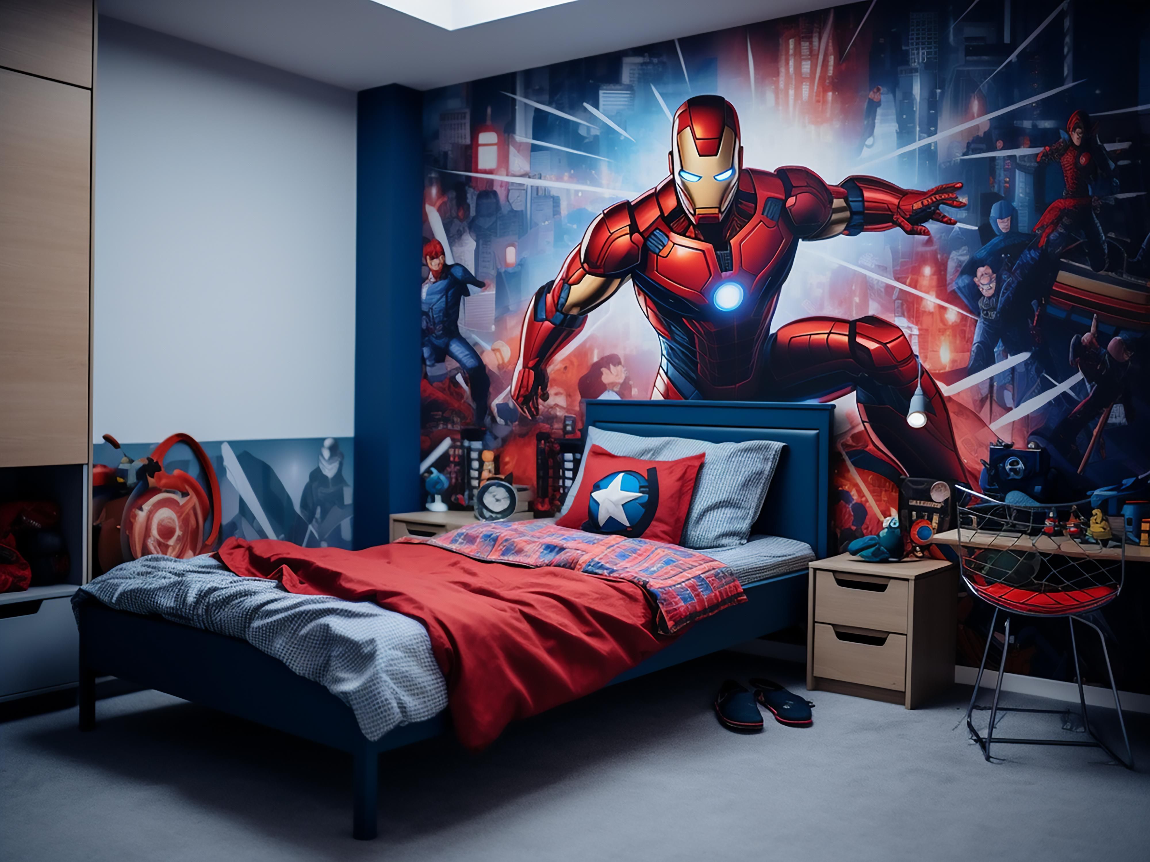
Integrating red into a home décor can give a space a sense of warmth, energy and dynamism. The red colour, known for its brightness and saturation, requires judicious application so that the interior does not seem overloaded. Here are a few techniques that will allow you to harmoniously weave the red shade into the ambience of your home:

  1. Select an accent area: Turn a selected wall into a striking accent by painting it red. This technique is especially effective in spaces that need a visual accent or extra volume.
  2. Decor and furniture: Introduce elements of red through furniture or decorative accessories such as vases, curtains or rugs. This will add bright colours without the risk of oversaturating the space.
  3. Combination with neutral tones: Red perfectly harmonises with neutral shades - white, grey, beige. This combination will allow red to become the highlight of the interior without disturbing the overall harmony.
  4. Combinations with contrasting colours: Use red in combination with contrasting colours to create a dynamic and memorable interior. For example, red and blue can create a bright and fresh atmosphere.
  5. Point Accents: Small red details such as picture frames, textiles or decorative cushions will add sophistication without looking excessive.
  6. Mixing with warm tones: Red can be combined with warm, calm shades to create a cosy and comfortable space.
  7. Application in different styles: Red is universal and can be adapted to any design style, from minimalism to baroque, it is only important to choose the right shades and textures.

It is important to remember the need for balance and harmony. Start small, gradually increasing the presence of red to avoid the effect of oversaturation and visual fatigue. Experiment with shades and textures, allowing red to enliven and enrich your home.

The combination of orange

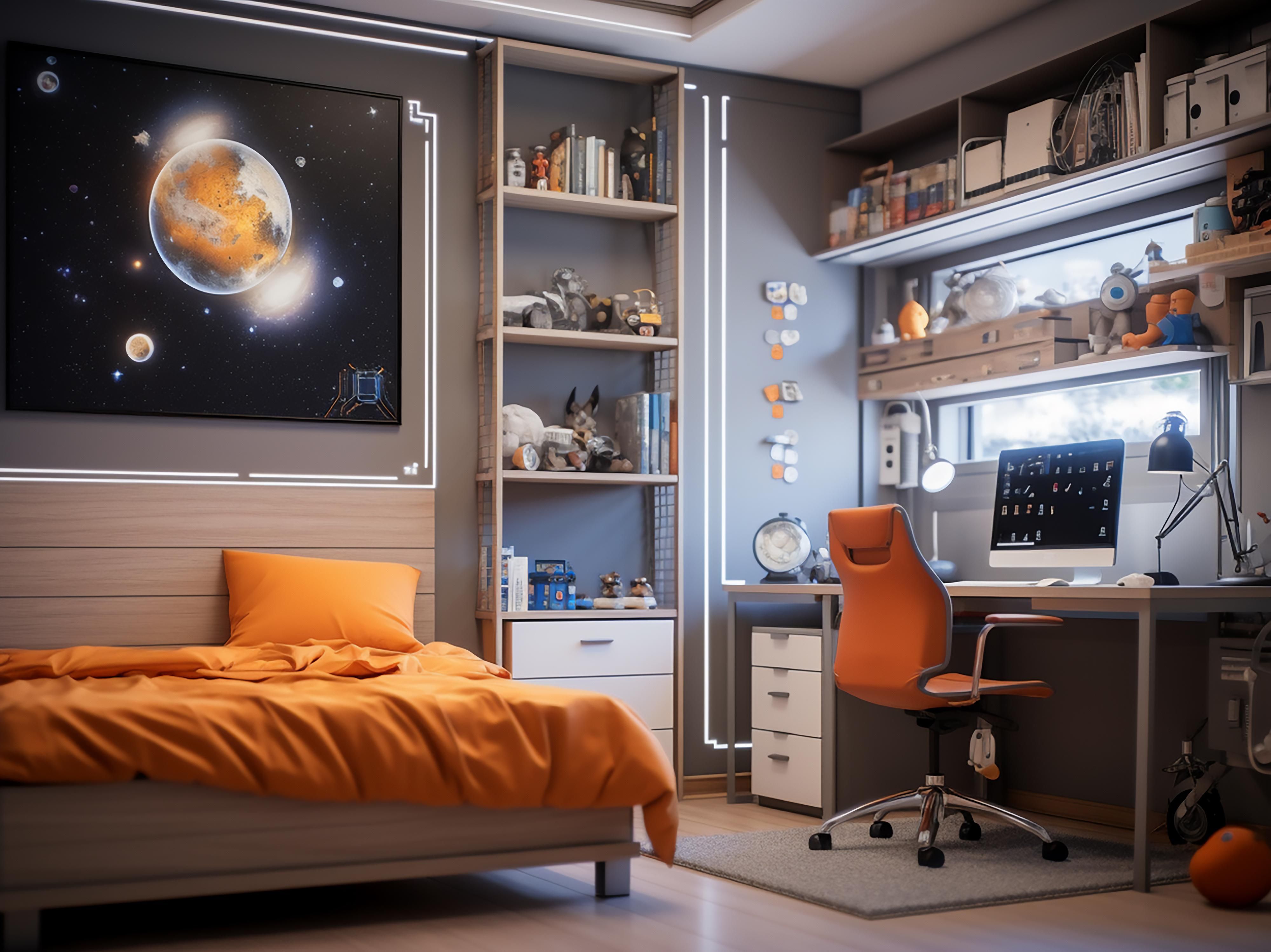
The introduction of orange into interior design promises to fill a room with a sense of cosiness, joy and vitality. Due to its origin from the combination of red and yellow, orange offers a wide range of possibilities for creating a unique design. Let's take a look at a variety of ways to harmoniously incorporate orange into your home:

  1. Main Wall Accent: Choosing orange for an accent wall or a section of an accent wall can be a decisive touch to liven up a room. This technique looks best in living areas such as the living room, bedroom or playroom.
  2. Harmony with neutral tones: Orange blends beautifully with neutral colours such as white, grey and brown to create an elegant and balanced look.
  3. Contrast with blue and green: Using orange paired with blue or green tones on opposite sides of the colour wheel will provide an exciting contrast.
  4. Deeper Shades of Orange: The richer and darker variations of orange, like terracotta, bring an air of warmth and comfort to a space, especially when combined with natural wood elements.
  5. Sunny Palette with Yellow: Combining orange with yellow and golden hues can create a sparkling and positive space filled with light and warmth.
  6. Softening with pastel colours: Combined with pastel and beige shades, orange creates a soft and relaxing atmosphere, ideal for relaxation areas.
  7. Decorative Accents: Adding orange accessories such as textiles, curtains or decorative elements will allow you to easily introduce bright accents of colour without the risk of oversaturation.
  8. Style diversity: Orange adapts easily to different design directions, whether minimalist, Scandinavian or more eclectic solutions.

When working with orange, it is important to keep the principles of balance and moderation in mind to avoid the feeling of excess. Start with small elements and gradually increase their presence, aiming to create a harmonious and attractive interior.

Purple colour

The introduction of purple in interior design promises to transform any space into a sophisticated and mysterious sanctuary. With its origins from the blending of blue and red, purple offers a vast range of shades, from pastel lavender to deep amethyst. Below are ideas for using purple effectively in decorating:

  1. Multi-level combination of shades: Create a sophisticated interior by combining different shades of purple - light lavender notes with rich purple accents will enrich your space with depth and volume.
  2. Companionship with neutral tones: Integrating purple with neutral hues including white, grey, and black can give a space a sophisticated and trendy look where purple is accentuated as a key element.
  3. Contrast with green: The bold combination of purple and green provides a lively and expressive contrast, bringing freshness and originality to the interior.
  4. Fusion with gold and yellow accents: Adding gold or yellow elements to a purple design gives the space a sense of richness and luxury.
  5. Duo with white: The combination of purple and white creates an atmosphere of calm and freshness, perfect for creating a light and airy space.
  6. Textiles and accessories: Adding purple elements through textiles or decorative items makes it easy to update an interior by introducing colourful accents.
  7. Flexibility in style directions: Purple is appropriate for a variety of designs, from classic elegance to avant-garde experimentation.
  8. Playing with metallic shades: The combination of purple with metallic elements such as silver or chrome gives a modern and elegant look to an interior.

When introducing purple into interior design, the key is to find harmony and avoid overdoing it to avoid feeling too heavy. Explore the variety of shades and combinations to discover the perfect balance that will reflect your individual style and create the desired atmosphere of comfort.

Blue colour in interior

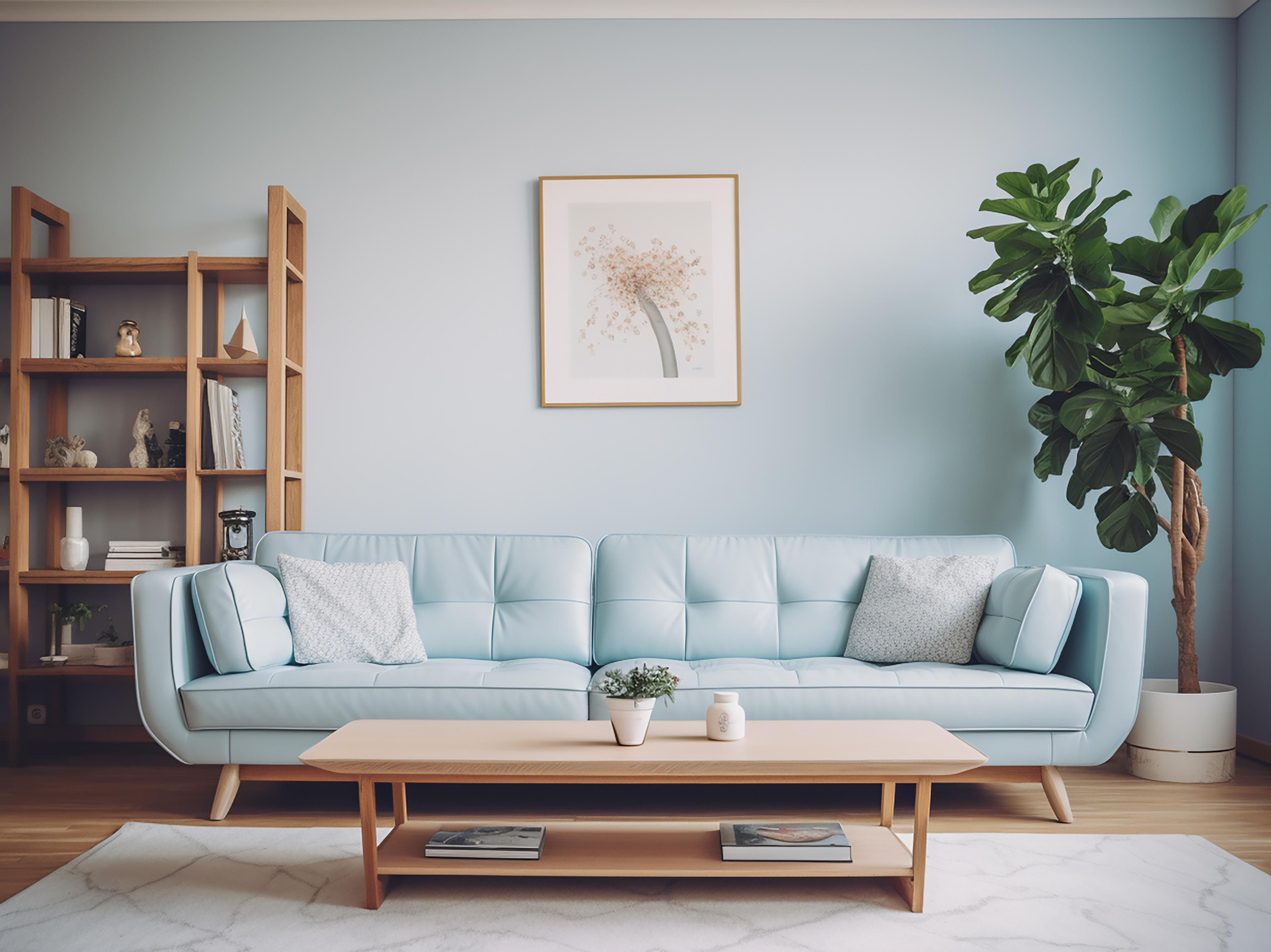
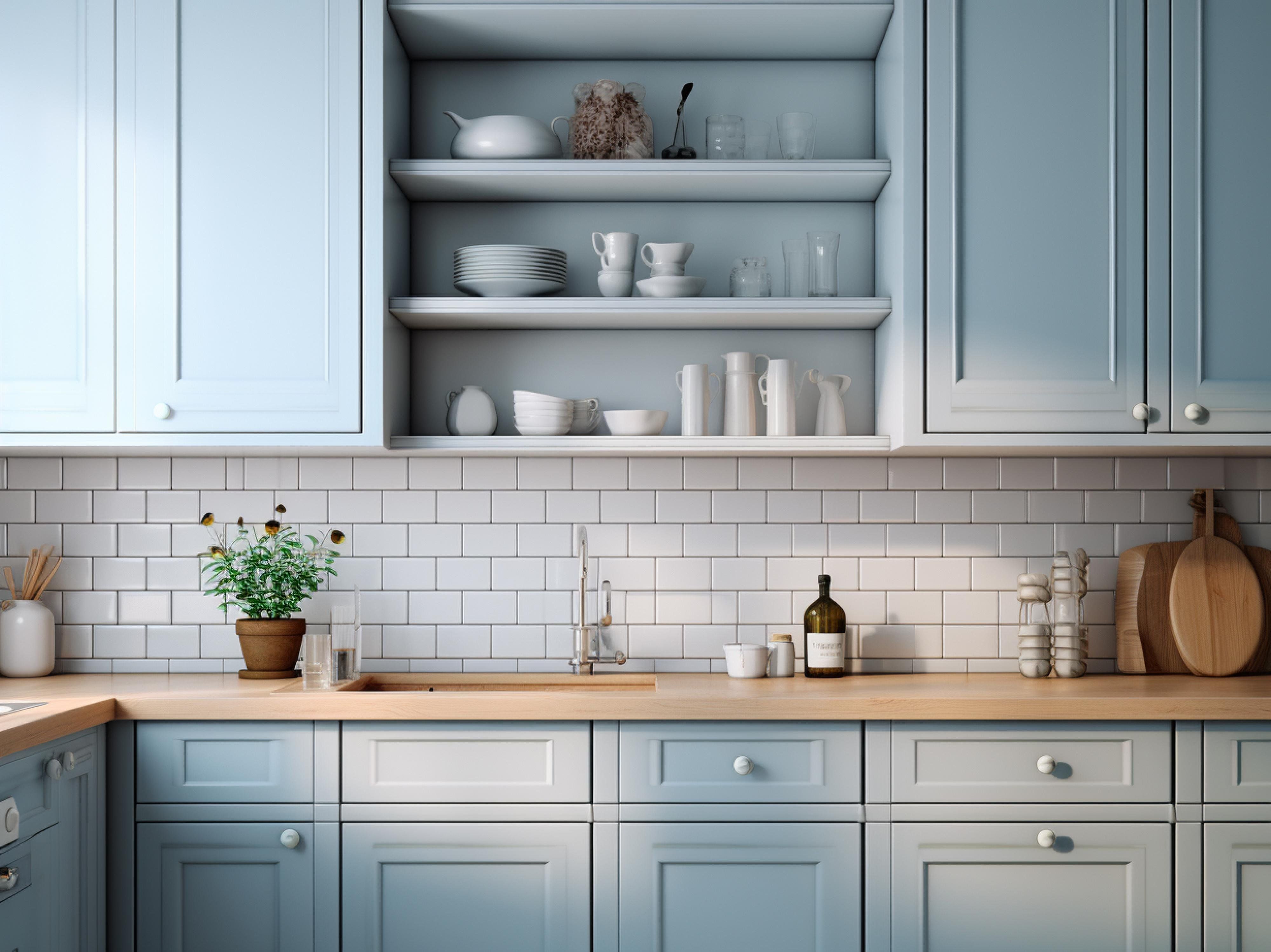
Integrating blue into interior design promises to transform any space into an oasis of calm and tranquillity. With its variety, from delicate blue to rich indigo, blue offers endless possibilities for creating a harmonious combination. Here are some ideas for using blue effectively in decorating:

  1. Multilayered Blue: Create an effect of depth and sophistication by combining multiple shades of blue in one room. This will give the space a sense of unity and calmness.
  2. Harmony with neutral tones: Blue blends perfectly with neutral colours to create an elegant and sophisticated design. White, grey, and sand tones can serve as great backdrops for blue accents.
  3. Freshness with white: The combination with white brings freshness and lightness to the interior, reminiscent of seascapes and celestial infinity.
  4. Natural Combination with Green: Blue together with green evokes the beauty of nature, creating a cosy and inviting space.
  5. Brightness with Yellow: Adding yellow elements to a blue interior brings brightness and visual interest to the space, creating an energetic atmosphere.
  6. Warmth with wood grain: The combination of blue with natural wood tones adds warmth and natural beauty to the interior.
  7. Nautical theme with turquoise: Combining with turquoise and turquoise shades can create a sense of sea breeze and summer mood.
  8. Textile Accents: Add blue accents through textiles - curtains, bedspreads, rugs, updating the interior without drastic changes.
  9. Modernity with metallic: Blue combined with metallic elements such as silver adds a modern and chic feel to the interior.
  10. Adaptable to different styles: Blue can be easily adapted to any interior style, be it costal chic or minimalist, offering many variations for design ideas.

Blue colour in the interior is not only decorative, but also brings an atmosphere of harmony and peace into the house. The right choice of shades and their combination with other colours and textures will create a unique space that reflects personal preferences and provides the desired effect of peace.

Green colour

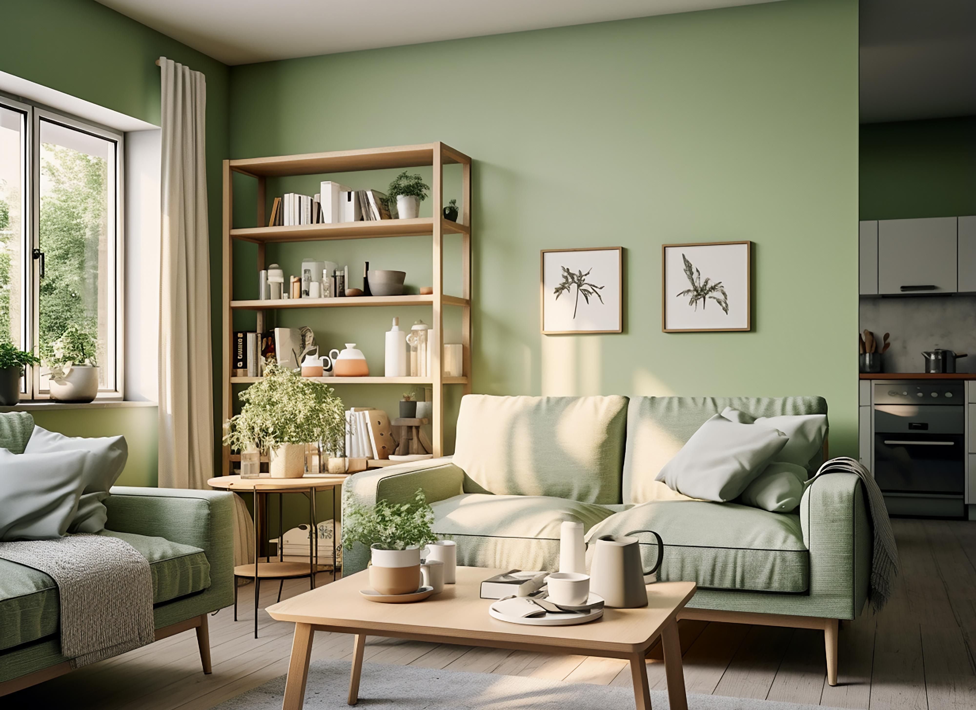
Using the colour green in home decorating helps to create an atmosphere of naturalness, calmness and newness. Green, symbolising life and rebirth, offers a wide range of shades, each of which can enliven an interior in a unique way. Here are some ideas for harmoniously incorporating green into the design of your home:

  1. Harmony with Neutral Tones: Green blends beautifully with neutral colour schemes, including shades of white, grey, and beige, providing a peaceful and sophisticated backdrop where green accents stand out.
  2. Bright contrast with red and pink tones: A bold combination of green with red or pink can bring brightness and visual variety to an interior, filling the space with vibrancy and energy.
  3. Freshness with white: The combination of green and white creates a feeling of purity and naturalness, reminiscent of a summer landscape.
  4. Sea Wave with Turquoise: Mixing green with shades of turquoise will fill the interior with a sense of freshness and lightness inspired by the beauty of the seaside.
  5. Wooden Heat: Green complemented with wood and brown tones creates a cosy and warm space where every element is in harmony with the natural aesthetic.
  6. Decorative Diversity: Incorporate green accents through décor and textiles such as cushions, curtains and rugs to easily make changes to your interior, adding vibrancy and natural motifs.
  7. Sophistication with gold details: Green combined with gold elements can transform a space, giving it a sense of luxury and nobility.
  8. Modernity with Grey: Green and grey together form a modern and stylish space where each colour complements the other, creating a cosy and trendy atmosphere.
  9. Style versatility: Green can be easily adapted to any interior style, be it minimalist, eclectic or Scandinavian, providing a wide range of creative possibilities.
  10. Elegance with metallic accents: The combination of green with metallic shades, such as copper or gold, adds sophistication and modern charm to an interior.

By incorporating green into your interior, you not only bring elements of nature into your home, but also create a space filled with harmony, freshness and cosiness. Experiment with shades and combinations to reflect your taste and achieve the desired cosy atmosphere.

Dvorsky.co.uk and our partners use cookies to manage performance, advertising and customer experience. By continuing, you agree to our use of cookies. Please review our policy to learn about managing cookies.
to top